I’ve received a great deal of positive comments about the new logo for Ngagementworks and additionally, curiosity about the creativity and thinking behind it. Rather than replying individually, I thought I’d share by way of this article how it came to be.

Why No E at the beginning?
There are 3 reasons behind this.
1. There are a lot of organisations that use the word engage or engagement. Dropping the E therefore provided differentiation. Phonetically, dropping the E makes no difference when you say the word either!!
2. The letter N, at the beginning, provides a play on words with the initial of my forename, Nick.
3. Starting with the letter N, links wonderfully with the colour model of human behaviour that I use. It provides the foundation upon which I facilitate learning and development programmes and also underpins the topics I speak about at conferences. The colour model and unique Discovery profiles are the IPR of Insights, who are based in Dundee. I have been a licenced practitioner for over 15 years and only use their profiles as in my opinion, they can’t be beaten. At a top level, there are four types of human behaviour, each with their own unique style, behaviour, communication and decision-making. The learning programmes ensure, that each of these different styles is valued and appreciated by team members and used to best effect.

Why Ngagementworks?
Quite simply when teams value and appreciate the different people in the team and the skills and strengths they bring, then eNgagement between individuals works and greater success, both individually and as a team can be achieved.

How did the logo develop?
It is said that we all get our best ideas in different ways. For some that’s lying in the bath, others after having a drink etc. For me it is when I am walking our dog. In my head, the letters of the word started to link together and I realised immediately that this is what I do when working with teams. I enable the team members to appreciate, link up, value and utilise the skills of their colleagues.
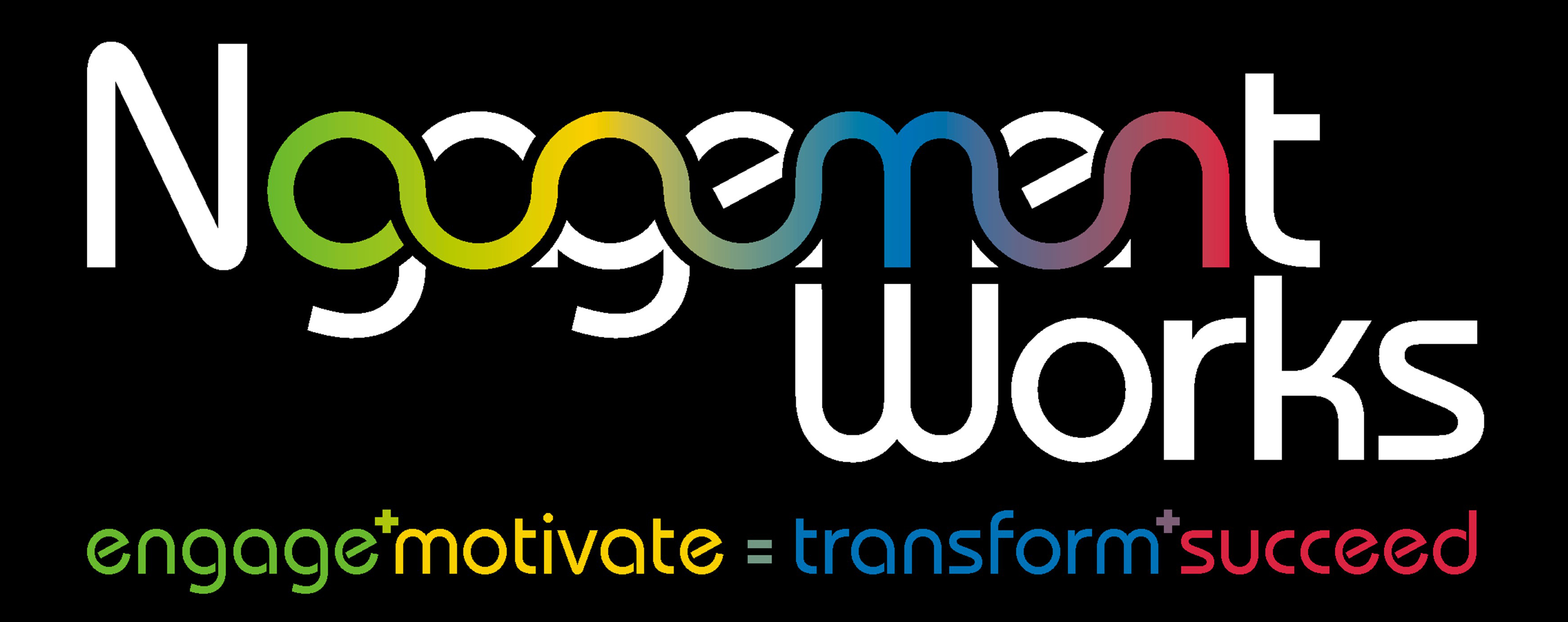
It was at this point that I contacted an exceptionally creative guy called Tim Gilpin. I have known Tim for many years. Tim owns a design company called Perception. I emailed Tim with my initial thoughts and left him and his creative juices to come back to me with his ideas. Tim knew of my work with the colour model of human behaviour and hence weaving the colours throughout the design. From the original brief to the final product, it only took a couple of weeks. Tim found a modern style font and also worked his magic, not only using the colour link, but also by dropping the word Works to the line below in order that the M of Ngagement and the W of Works aligned.
What is the relevance of the strapline?
Whether it is a team workshop or speaking at a conference, I engage individuals, motivate teams and in doing so, help them transform and achieve even greater success.
Additionally, the colour of the words represent the colour of the behavioural style, that the word is associated with and also the colour order of my behavioural style i.e. leading with Earth Green, Sunshine Yellow, Cool Blue and least Fiery Red.
Tim also added an additional bit of creativity by off-setting the mathematical signs that link the words.
I hope that you have found this article of interest and also understand how the logo was developed.
All the best, Nick Fewings, MD, Ngagementworks
I also have a presence on Facebook, my website, Pinterest, LinkedIn, Slideshare, Twitter and Google+.
The Team Wellbeing Index White Paper 300625
For...


